
Silent Bloom: Summer Look-Dev
- Julian Schenker
- Aug 3, 2025
- 3 min read

Updated: Sep 17, 2025
This will be a look behind the scenes for my look dev for my teams TBA Virtual Production. Our short will be a post-apocalypse travel piece, so any locations referenced will be stylistically changed to fit our aesthetic.
My first goals for getting the project on track is to start early models and look dev lighting for a few of our locations: Chicago, Chicago Union Station, Albuquerque, and a few other small set pieces.
To start with the train station, I found the dimensions of the main hall online and boxed out the approximate proportions.


I then did some light texture work so that I could experiment with lighting and environmental changes. The goal is to find the right amount of post apocalyptic wear and tear we want on the building.


Putting this portion of the work aside for future discussion, I then moved on to try and plot out some looks for the quarantined city of Chicago. Our idea for Chicago is that only a small portion of the city is used, walled off from any outside presence. I found a very low poly (and rather janky) version of Chicago online and downloaded it for use.

Full disclosure, I will probably have to manually create a lot of buildings custom because the quality of this free asset is not very good. But for backgrounds and for our purposes as of now, it will work.
Despite the model setbacks, I altered textures to make the the buildings look less flat.
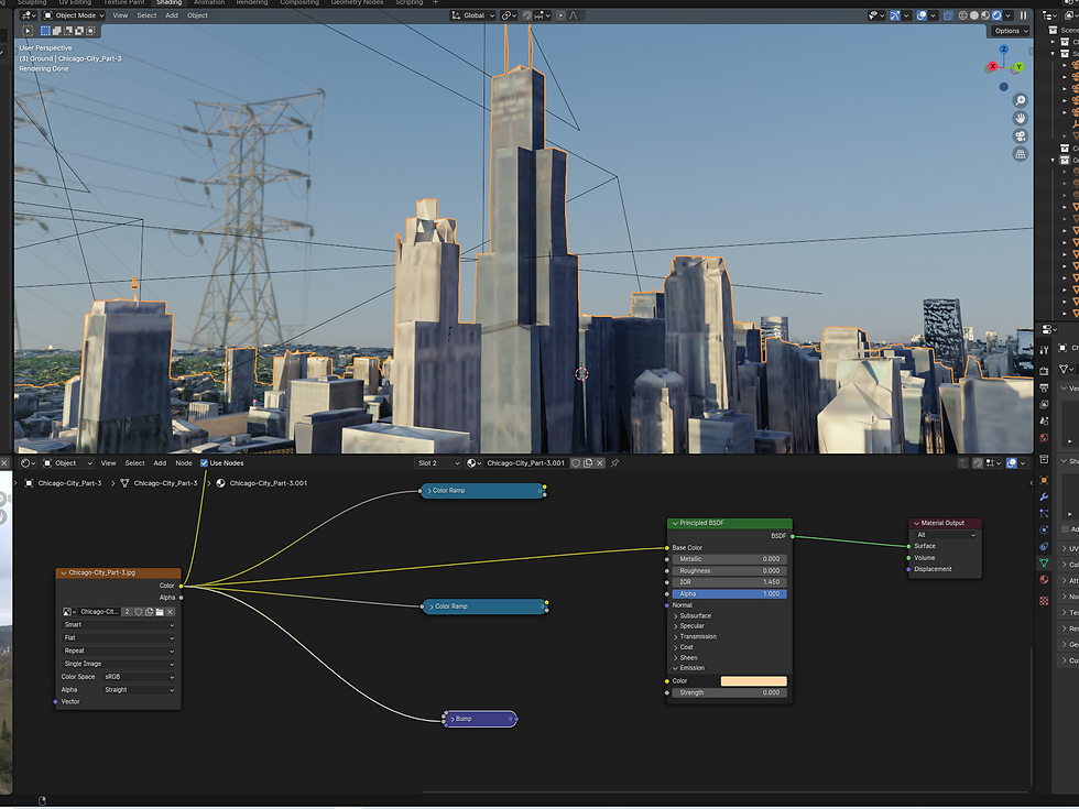

I also added in cards and foliage to try and differentiate between inside the wall and outside.
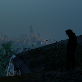
Here is the first atmosphere, camera and lighting tests I tried.


Here is the second angle.


Here are the remaining camera angles I tested out.


8/29/25
I want to show some of the updates and newer lighting tests I have made in the past month. A lot has been done to refine our project idea, and having a concise beat board and script has helped for knowing which environments to focus on.
Firstly I will show the train station. We decided to open the back wall up to include windows to aid with volumetrics. We also decided that since our world has an increasingly higher necessity for security, adding armed guards stationed to keep order was a smart idea.


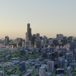
Here are some look-dev shots for how Chicago could look from inside the train car.


9/8/25
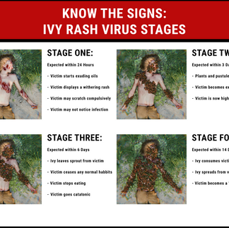
I want to share some early character design for The Withered. I went with a design based upon existing cases of Poison Ivy rash as well as Poison Ivy plant growth. I came up with a design that is almost human looking but also very plant-like. I wanted the design to be graphically uncomfortable but also have a natural element to it that is silent and almost beautiful.


9/10/25
Today I am posting some updates I have made for the Chicago Union Station as well as some in-universe propaganda fliers that I have been working on. Although there are 9 months to finish up this project, I want to get as much done for lore and environments as I can now.
For the Chicago station, I finally added real windows that better match my reference image. The left image is the atmosphere/window reference and the right image is a test render.


Like I mentioned before, I started work on expanding out the lore by creating some info-graphics that will be displayed within the walls of the city.


Comments